Abstract
I had the occasion of visualising the French political Twitter just before the presidential election of 2022, in collaboration with other researchers and the journalists of the French newspaper Le Monde. In this paper, I reflect on this case in an auto-ethnographic style to open the black box of visual network analysis and expose the entangled dialogue between human expertise and computation. I contend that the visualisation’s validity does not root in mechanical objectivity because human judgement was involved at multiple levels, even though that work is not visible in the produced image itself. Like the proverbial “mechanical Turk”, a 18th century chess-playing automaton actually hiding a human player, this big data visualisation hides a reliance on man-made decisions. I first present the origin and social dynamic of this project, I document the methodology employed, I unpack what the map represents, and I explain how to read it (that section is incidentally relevant to the reader interested in French politics). I then return to the question of human judgment to expose in detail how the map was shaped by a negotiation between the journalists from Le Monde, my own research agenda, our methodological commitments, the algorithms employed, and the constraints imposed by the data themselves.
Introduction
Anywhere an algorithm is employed, you will find someone to justify its use by mechanical objectivity, “a tremendous desire to find scientific objectivity precisely by abandoning judgment and relying on mechanical procedures—in the name of scientific objectivity” (Galison, 2019). But algorithms rarely work in isolation, they are embedded in sociotechnical assemblages also involving human judgment. Like with the proverbial chess-playing mechanical Turk, the disappearance of the human is just an illusion. Dispelling it, however, requires some work.
In this piece, I will be opening the black box of such a human-algorithm hybrid. From the inside, as a part of it. My motivation hinges on what mechanical objectivity, as an argument, does to the social sciences and humanities: it robs qualitative methods of their validity. Yet in the work I will showcase, the quantitative findings obtained by algorithmic means depend on a series of qualitative judgments. And those were in turn accounting for quantitative results. This dependency loop, requiring an iterative process, is characteristic of the quali-quantitative methods (Borra & Moats, 2018; Latour et al., 2012). The case is about a visualisation obtained by algorithmic means, used to illustrate quantitative findings, but that required a qualitative coding to be interpreted, the same way the mechanical Turk requires a hidden human player. I contend that, even though quali-quantitative methods may look like a delegation of the science work to computations, most impactful decisions are still being made by humans on a qualitative ground. The misunderstanding is due to the invisibilization of human judgment when the science-in-the-making process gets blackboxed into scientific (or journalistic) publications. In this article I expose those decisions, how they interrelate with computational and data constraints, and I retrace how they shape the methodological outcomes.
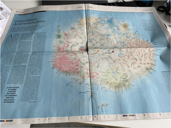
The case. For the French newspaper Le Monde, I made a giant network map of the Twitter space about French politics just before the 2022 presidential election (fig. 1), titled “Géopolitique de la twittosphère” (geopolitics of the Twitter sphere). It can be accessed online.1 I collaborated with data scientists and journalists to harvest, process, visualise and analyse the data. We had different goals and perspectives, and we continuously negotiated the direction of the project and how to operationalise it. The journalists wanted to write a nice series of articles, and I wanted to publish a big network map. I wanted to see if it would make a difference to the audience, and if so, how. Our goals were broad, and this map was not the only one capable of meeting them. Our process led us to this particular visualisation because the data constrained us. And at the same time, the same data could have been visualised and analysed by other means. As I will document in this piece, making the map required navigating the inevitable entanglement of our goals and methodological means with the technical constraints attached to the data. The situation is common in data science, but in this specific case, the heterogeneity of the actors involved forced us to make the sociotechnical entanglement explicit during our negotiations.

the map in the paper edition of Le Monde, April 1st, 2022. The article on the left analyses the corpus of tweets visualised on the right part, also drawing on the knowledge of journalists specialised in French politics.
Citation: Political Anthropological Research on International Social Sciences (PARISS) 3, 2 (2022) ; 10.1163/25903276-bja10037
To unfold the case and make my argument, I will start by explaining how this project came to be and what was its social dynamic. Then I will document the method we retained and what exactly the map represents. I will explain how to read it, by specifying which knowledges one can or cannot get out of it. At this point, the reader should be more familiar with the map itself, and I will then return to the question of human judgment. I will expose how the map was shaped by a negotiation between the journalists from Le Monde, my own research agenda, our methodological commitments, and the constraints imposed by the data themselves. But before that, for the readers unfamiliar with the French politics of 2022, a quick refresher is necessary.
French politics before the 2022 presidential election
When Emmanuel Macron wins the 2017 presidential election followed by the legislative elections, for the first time of the Fifth Republic and to the surprise of many, the leading political formation in France is neither from the left (Parti Socialiste) nor from the right (Les Républicains). Macron’s centrist party (En Marche!) is firmly committed to rendering the traditional left-right divide obsolete. The first key to understanding the political situation in 2022 follows from this unprecedented reconfiguration of the French political landscape: will it stick, or will the left-right divide make a come-back?
One of the remarkable aspects of Macron’s presidency was the opposition to his domestic reforms, culminating with the yellow vests protests, and to his response to the covid-19 pandemic. Like Macron’s party, these groups of protesters seemed to transcend the left-right divide. This is the second key to understanding the political context of the election: is this the emergence of a new anti-elites or anti-system political movement? The people-elites divide is a major concern in Western democracies, although its relevance is debated (Stavrakakis et al., 2017; see also Morales et al. 2021).
The third and last key to understanding the stakes of the French 2022 political landscape is simply the rise of the far right. Marine Le Pen, leader of the main far-right party, is expected to benefit from a weakening of the left-right distinction and a strengthening of the anti-elite sentiment. But a new contender, Eric Zemmour is now challenging her from a more radical position (anti-immigration, anti-Islam…). How will this play out?
You will find in Table 1 below the list of the main political parties relevant to this election, their candidate to the presidential election, and the colour we associate to them in the map.
Context: How this Project Came to be
The map came into existence as a collective work initiated by Guilhem Fouetillou, “Chief Evangelist Officer and Cofounder” of “Linkfluence, a Meltwater Company”.2 The core business of Linkfluence is social media listening. Through Fouetillou, Linkfluence had already collaborated with Le Monde to analyse the web and social media at the occasion of multiple French presidential elections. Fouetillou gathered researchers he trusted to form, together with him and a team of journalists from Le Monde, a collective capable of analysing the social media data harvested by Linkfluence. The collective primarily discussed in a dedicated Slack channel (an asynchronous message board) complemented with online and/or in-person meetings. It gathered from the end of January and until the publication of a series of articles in the digital and paper editions of March 31st, April 1st and 2nd, 2022.
I would summarise the internal dynamic of the collective as a “free for all”. There was no structure or project beyond Fouetillou’s original proposal and the interest of the journalists. The researchers involved were completely free to participate as much as they wanted, the way they wanted. Some remained mostly silent observers, while others took initiatives in the collective work. Most researchers offered their pre-existing knowledge, a few processed and analysed the Linkfluence data, sometimes both. The main academic actors who ended up contributing to this work were the researchers and engineers from Linkage, a cnrs research project: Pierre Latouche, Charles Bouveyron, Carlos Ocanto and Stéphane Petiot. They processed the data so that I could visualise it, and they produced analyses with their own method, also featured in Le Monde. We shared the understanding that our common goal was to empower the journalists, and in that sense, we offered them opportunities that they were free to seize or not. Not all the work done was represented in the articles. More importantly, the content of those articles was only partially shaped by the collective.
The content of the articles has an interesting relation to the visualisation. Their content appears to conflict with the presence of the map, because there is a massive presence of the candidate Zemmour in the map, while the articles downplay it; and with quite a bit of foreseeing, since Zemmour’s score at the election would turn out surprisingly low (7.07%). To understand the discrepancy, let me highlight first that although the visualisation is presented along with the articles, the journalists did not shape the image (aside from the colours, I will return to this), and I did not participate to the writing. The articles were organised as a coordinated series of 4 articles, each by different authors, titled as follows (as translated by me):
- 1.Should we quit Twitter, a claustrophobic space turned hostile?
- 2.Eric Zemmour, new president of the fascist sphere?
- 3.How the social-democratic left lost the social media battle
- 4.Brigitte Macron and Jean-Michel Trogneux, itinerary of a delirious fake news
To which I should add the title of the series, Diving into the campaign on Twitter, between an activist ecosystem and a distorting mirror, and an article in the paper edition titled Geopolitics of the Twitter sphere, integrated within the map (Fig. 1). The large map was the most strongly associated with the first article, focusing on the toxicity and biases of the Twitter political space. On the one hand, the map seems to convey the idea that Zemmour is important while the article contends that he is not. But on the other hand, the article’s argument builds upon the idea that actors like Zemmour are overrepresented on Twitter, which the visualisation contributes to establish. In short, the image and the article do not ignore each other, but one cannot simply say that the map illustrates the article. It complements it with its own information.
Data Processing Method
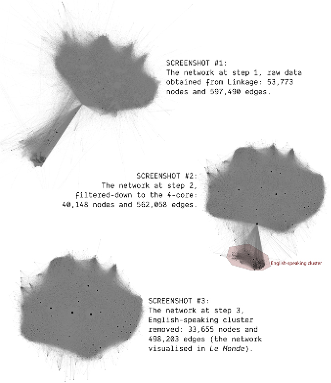
The network map represents about 30,000 Twitter accounts derived from an original corpus of about 600,000 tweets. Those tweets have been harvested by Linkfluence using two simple criteria: referring to at least one candidate to the presidential election and being tweeted between the 3rd and the 21st of March 2022. In this context, referring to a candidate consists of tweeting a message containing their full name, their personal Twitter account, or the account dedicated to their campaign. These Twitter data were processed by Linkage, who assembled and passed to me a network consisting of those 50,000 accounts and their interactions. By interaction, I mean here the act of mentioning or retweeting another account in a tweet of the original corpus. The network I visualised in the final map is a subset of the network obtained from Linkage. I reduced the dataset in two steps (cf. Figure 2). First, I filtered out the accounts with interactions with strictly less than 4 other not-filtered-out accounts, a subset known as the 4-core in the language of network analysis.3 Second, I removed clusters consisting of English-speaking accounts. The rationale for this second step is the presence of an intense discussion about the outgoing president Macron and his diplomatic endeavours following the invasion of Ukraine by Putin’s Russia. This discussion being almost entirely disconnected from the rest of the interactions, we (Linkfluence, Linkage, the journalists and I) decided to remove it from the corpus. The cluster was already identified in the data by Linkage’s community detection algorithms.
Steps of the network filteri○
Citation: Political Anthropological Research on International Social Sciences (PARISS) 3, 2 (2022) ; 10.1163/25903276-bja10037
Visualisation Method
The process I describe in this section reflects the steps leading to the map published in Le Monde, but it is not a chronological account. Many trials and errors happened before these steps were stabilised. I will account for these iterations in a later section.
The first step is the layout. Each node (i.e., Twitter account) is placed in a 2D space according to its edges (i.e., Twitter interactions). I need to emphasize this: the placement of each node depends solely on its connections, it ignores any attribute we may have about it, like its political affiliation, or the cluster it belongs to (as computed by Linkage). Each account is placed according to the other accounts it has interacted with, and nothing else. In practice, I used the Force Atlas 2 algorithm (Jacomy et al., 2014) with the LinLog energy model (Noack, 2004) in the network analysis tool Gephi (Bastian et al., 2009) to obtain a satisfying placement. I will return later to what “satisfying” means in this context.
This layout algorithm is isotropic, it works the same in any direction, contrary to a statistical projection, where the axes have a proper meaning and can be scaled independently. An isotropic placement can be flipped and rotated without altering its qualities and meaning. However, I needed to account for our spatial intuition of the political spectrum. I rotated the layout in order to have the political left on the visual left, and the political right on the visual right.
Second step, I scaled the nodes by how cited they were in the corpus (the “indegree” in the jargon of network analysis). This choice accounts for the fact that it is more difficult to get cited than to cite. Citing means, in this context, being retweeted or mentioned in someone else’s tweet. The biggest dots indicate the Twitter users the most cited in the corpus.
Third step, I coloured the nodes according to their political affiliation. The double question of colour and political affiliation was intensely discussed in our collective, and I will dedicate a section of this piece to that debate. We settled on a partial qualitative coding of the accounts. The journalists manually retrieved the political affiliations as declared by the Twitter users in their account (when they did), but only for about 1000 accounts, or 3% of the corpus. That effort was already considerable and time consuming. The coding used the typology of political affiliation in use among the journalists at Le Monde. In the final map, only those 3% of the nodes are coloured, the others remaining in grey. However, I used a colour halo to emphasize the regions where nodes of the same colour gathered, and it proved sufficient to give a sense of the political polarisation within that Twitter space.
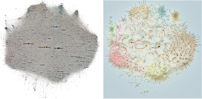
Last step, the rendering. This step involves a number of semiotic choices that I will discuss separately. I used custom scripts to produce the most readable and intuitive image possible (fig. 3). One of those choices was to not display the edges.
The same network in Gephi (left) and properly rendered by custom scripts (right). Both images have the same nodes at the same place with the same size and colour, but they have very different visual affordances.
Citation: Political Anthropological Research on International Social Sciences (PARISS) 3, 2 (2022) ; 10.1163/25903276-bja10037
How to Read the Map, and What it Tells us
Although network maps are often presented as self-evident, they are not. In a map like this one, two important facts are easy to miss and deserve the reader’s attention. First, the node placement refers to the edges. In other words, the position of the Twitter accounts depends on their interactions with other accounts. As a consequence, even though the interactions are not visualised literally (as lines connecting the dots, for instance), they are still represented as the distances between the dots. I repeat: the interactions are visualised. Second, node positions and node colours are a priori independent. They depend on two different things. As we have seen, the placement depends on the edges (Twitter interactions) while the colour depends on an attribute (political affiliation). The layout ignores the colour and vice-versa. That is why it is remarkable that the layout and the colours are relatively aligned. This alignment is visible through the fact that each visual cluster (densely packed group of dots) has a homogeneous colour (political affiliation). As figure 4 shows, the correspondence between clusters and colours is not a given. The clusters could have had mixed colours. But they do not, which indicates homophily: Twitter users with a similar political affiliation tend to interact more with each other. I will unpack this argument further, but self-evidence deserves a comment. The correspondence between clusters and colours is intuitive. Not only it conveys a sense of order that we expect of a visualisation, but it also corresponds to our political intuition: each political party is in its right place, and with its conventional colour. I call “self-evidence” the fact that we find a confirmation of our beliefs in the map. Self-evidence is not detrimental, as we do need landmarks to engage with the visualisation and interpret it, but it also hides certain things, notably the fact that the homophily of interactions is not a given.
The layout and the colours are independent. That is why it is remarkable that they correspond. It indicates homophily: actors with a similar affiliation interact more. In this case, the data featured such homophily. The bottom-left map is a fake I produced for the sake of the example, by swapping colours randomly. The bottom-right map visualises the actual data.
Citation: Political Anthropological Research on International Social Sciences (PARISS) 3, 2 (2022) ; 10.1163/25903276-bja10037
Properly understanding the network map requires circulating through multiple layers of mediation (Latour, 1999): from the tweets to the network (nodes and edges), to the layout (node coordinates), and finally to the image (semiotic make-up). The first step, the reduction of the raw Twitter api data to a relational data set, has nothing unusual in data science. The last step, the work of graphical design to produce the map (fig. 3), is a classic endeavour in data visualisation, and has more to do with classic cartography than network science (although I will elaborate on it later on). No, the difficult step to unpack is the layout, notably because it involves an algorithm. As I insisted, the layout translates the edges, and that translation task is entirely done by a node placement algorithm; in this case, Force Atlas 2 in the LinLog mode. It takes the edges as an input, and outputs the node coordinates. Understanding the network map entails understanding why the nodes have been placed where they are by the algorithm.
Take one node: what does its position tell us about its connections? There are two kinds of answers to that question, none of which is satisfying. The first kind looks at how the algorithm works: as a simulation where repulsive forces are applied to every node pair, and attraction forces to every connected node pair (Jacomy et al., 2014). As a result, it tends to place connected nodes closer; it only tends to because it fails for many pairs, and it has to fail so. Indeed, it is mathematically impossible for most networks to get a layout where all connected node pairs, and only those pairs, are close. As a result, one cannot directly interpret distances as connections. Many close nodes are not directly connected, and many connected node pairs are placed far away (Jacomy, 2021). The functioning of the algorithm only tells us that nodes are often close to their neighbours, but not all the time, which is neither precise nor informative enough. But there is a second way to interpret the layout: as a manifestation of the community structure (Noack, 2009). Which in turn begs: what is a community structure? I will not expose the underlying argument, but in short, it boils down to circular logic. Indeed, community structure is generally defined in the literature as the output of community-detection algorithms (Jacomy, 2021) where communities are characterized by their assortativity, by the fact that their nodes are more densely connected internally than to nodes outside of the community. We know that communities are assortative, but beyond that fact, they just get defined as the output of an algorithm. So (1) placement algorithms make communities visible; (2) communities are defined as the output of an algorithm; and (3) those two kinds of algorithms, node placement and community detection, are mathematical equivalents that manifest assortativity. This is as vague and poorly informative as the first way of interpreting the layout, albeit in a different way. Those techniques are popular, but not because they have a solid mathematical foundation, only because they are useful in practice. In short, we must live with an incomplete understanding of how the placement relates to the network structure. There are only two things that one can reasonably assume: first, close nodes are directly or indirectly connected, although we know that distant nodes are not necessarily disconnected; and second, the visual clusters are groups of nodes that are more densely connected together than with the rest of the network. The scientific grounding of these assertions is loose, but most network analysts would agree with them.
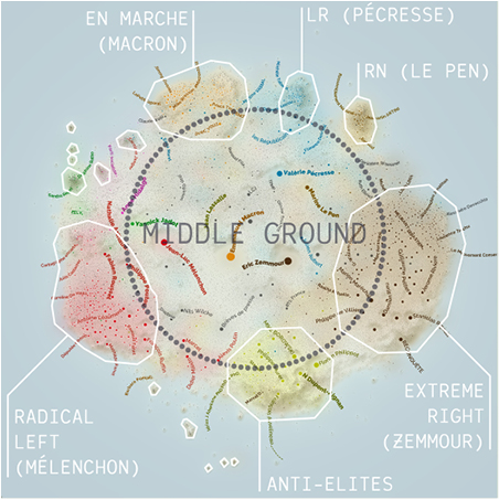
In the case of our network map, clusters are well delineated (as groups with denser interactions) and well characterized (by their political affiliation), but that is not where it ends. The structure of the network does not consist of solely clusters. Indeed, there are other kinds of assortative structures, other forms of communities than isolated groups, and notably what I call “stretchings”. These structures are cluster-like locally but do not form a group, because they stretch continuously without weak points where to split them into separate pieces (Jacomy, 2021). Importantly, layout algorithms are good at manifesting those non-clustery assortative structures. Which is good, since making structures visible is the purpose of the algorithm, but also bad, in the sense that stretchings are not as easy to acknowledge as clusters, and may even obfuscate them. This is precisely what we see in our network map, so let us look at it once again (fig. 5). The visual clusters can be found on the sides, as densely packed, single-coloured groups of dots. If we look closely, we recognize the political parties, especially for eelv (ecologists, in green), ps (left, in pink), En Marche! (centre, in orange), lr (right, in blue) and rn (far right, in light brown). Those clusters are well-defined and not too big. On the bottom, we find three bigger and less well-defined clusters corresponding to communities larger than parties, the radical left (in red), anti-elites (in yellow) and extreme right (in dark brown). But all of those do not account for the biggest part of the map, in the middle, where most of the nodes are small and colourless. Let me call that space the middle ground. What does it consist of? Two different things. First, a few hyperconnected actors that have interactions across the whole political spectrum. Those are the big, coloured dots, including the main candidates. Second, minor actors that tweet less, thus interact less with other actors, but also have fewer partisan interactions. They appear in grey because we did not fetch their affiliation, but they appear in the middle because they may just not have an affiliation. Those actors interact with multiple sides of the political spectrum, which is why they are not placed within a cluster. But it does not mean that they interact as much with every side, which is why they spread across that whole space. Those on the left have more interactions with the political left, and so on. The middle ground is what I call a stretching: not necessary a community in the sociological sense, too sparse to be considered a cluster, but an assortative structure, nevertheless. Equipped with this sense of the node placement, we can account for the structure of the network beyond the few obvious clusters and interpret their relation to the middle ground.
Annotated version of the Le Monde map with bigger labels to improve readability at this size. Visual clusters delineated in white, with labels for the bigger ones (political affiliation and name of the main candidate). In dark in the centre, the middle ground where nodes do not belong to any cluster.
Citation: Political Anthropological Research on International Social Sciences (PARISS) 3, 2 (2022) ; 10.1163/25903276-bja10037
The small, well-defined clusters on the top side are the traditional political parties, shaped as such because they behave mostly as echo chambers. By contrast, the middle ground is not structured as a partisan echo chamber, which is why it spreads out between all the parties. In the middle ground, the position of the Twitter users depends gradually on whom they interacted the most with. Someone who interacted across the whole political spectrum but more with the right than with the left gets placed on the centre-right. The three big clusters on the bottom side correspond to hybrid structures, partly structured as echo chambers, partly merging with the middle ground.
The key to understanding the emergence of these structures is the value of an interaction. Interacting with someone in this Twitter space is acknowledging them; it provides them with engagement, it makes their content more visible… It is commonly accepted, as a general rule, that interacting with your opponents or competitors is counterproductive. Conversely, it helps to have a community of aficionados who engage and rebroadcast systematically your own content, as it makes it exponentially more visible. Therefore, structured institutions like political parties have an incentive to rebroadcast exclusively their own content and ignore the rest completely, building an intentional echo chamber. However, this strategy has two key limitations. First, insofar as the echo chamber requires editorial discipline, it gets difficult to enrol members beyond the most enfranchised circles. This discipline conflicts with the Twitter practice of simple supporters. Second, there are situations where, on the contrary, it is profitable or inevitable to interact with one’s opponents and competitors. Low-visibility actors are more susceptible to question or mention high-visibility actors, including of the other side of the political spectrum. Indeed, the risk is virtually null while there is the potential benefit to get legitimacy and exposure out of an improbable answer. High-profile actors have much more to lose by interacting with each other publicly. During a presidential election, on Twitter like in traditional media, the candidates in the best position will often avoid direct interactions, while those in a worse position must challenge them to get more visibility and legitimacy. As a result, partisan but high-profile accounts are drawn to the middle of the map because they are mentioned by less visible accounts with different political affiliations. Almost any actor of this map, i.e., anyone but the top personalities with the most interactions, is either in the middle ground, enrolled in the echo chamber of a party, or a little bit of each. The most visible personalities are either at the centre of a cluster, because only their echo chamber wants to interact with them, or pulled toward the centre of the map by interactions from across the spectrum. This is why the middle ground has the many small dots and the few very big dots, while the clusters have the medium-sized dots. The middle ground consists of the actors that are either not visible enough to discipline their interactions, or so visible that they cannot escape being challenged from all sides, while the clusters consist of actors that are visible enough to build an echo chamber but not visible enough to get drawn out of them in the map. The map allows observing and documenting the division of the communication labour.
The asymmetry of the interactions is a key aspect of the network but is poorly represented by the network map. That is a weak point of dot-line visualisations in general, and I want to acknowledge it here. For instance, the highly visible actors drawn to the middle of the map, and notably the main candidates, look like they do not belong to their party’s cluster anymore. That would be a misunderstanding. Indeed, in the structure of the network, they belong both to their clusters and to the rest of the network. Structurally, they are somehow everywhere, but of course we have to represent them somewhere. The key missing information is the direction of the interactions: 95% of interactions are directed from a less-cited account to a more-cited account. The accounts of the main candidates, the most visible in the corpus, are cited from all parts of the corpus while they do not cite anyone. Their position at the centre of the map is not due to a lack of belonging to their own party, but to being cited by actors from other parties. They stand at the top of a very hierarchical structure where content is almost exclusively broadcasted from the more-visible to the less-visible actors.
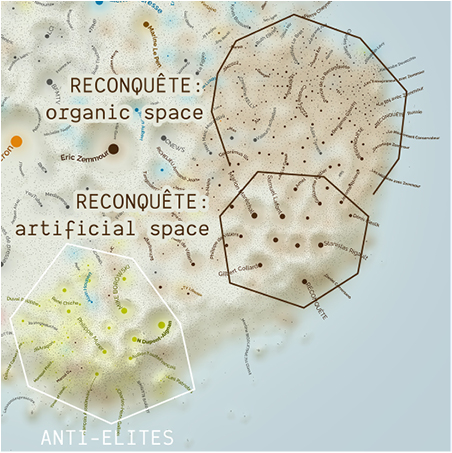
By looking at the size and position of the clusters, the map tells us something about the different strategies. I am assuming here that the size of a cluster can be inflated by various means, and I do not think that a large cluster reliably predicts success in the voting booth. But conversely, small clusters are remarkable to me, precisely because it is not too difficult to be represented on Twitter. The socialists have a small cluster and a very poor, diffuse presence in the corpus, which I take as a clear sign of the strong decline of this once-defining force in the French political landscape. On the right side of the spectrum, the republicans (lr) are also on the decline but resist a bit better. Their cluster is present even though its size is modest, but more interestingly, we do see the leakage of personalities to other parties. We do see a number of blue dots in the orange cluster (people who disclose lr as their affiliation but participate to the En Marche echo chamber) or close to the brown cluster (extreme right). The presidential party En Marche has a bigger cluster than the other moderate parties (ps, lr) and even the rn (Marine Le Pen). However, three clusters are even larger: Mélenchon’s radical left (in red, on the left); Zemmour’s extreme right (in dark brown, on the right) and the anti-elites (in yellow, at the bottom). Those groups are overrepresented on Twitter, which is not surprising since social media are a privileged space for activism. I can only hypothesize the exact reason for this overrepresentation, and it starts by the culture of directly questioning personalities on Twitter to hold them accountable; indeed, by design, citing a candidate gets you in this corpus. The anti-elites for instance, a group where we find yellow vests, conspiracy theorists, and minor populist politicians, are massively interacting with Macron, which may lead them to be more represented in the corpus than groups that do not have the practice of mentioning candidates a lot. The case of Zemmour’s extreme right is a bit different, though. The map shows the signs of an artificial strategy to inflate the digital presence of his party, Reconquête. His large cluster consists of two distinct parts (fig. 6). The top part, that I dubbed “organic” in the figure, has the same gradient of visibility than the other clusters: many small dots, some medium-sized dots, and a few big dots. By contrast, the bottom part, that I dubbed “artificial”, only consists of low-visibility (small grey dots) and high-visibility accounts (big brown dots). Those high-visibility accounts are Zemmour’s lieutenants, and their high number of citations is in part the fruit of a coordinated effort to build Zemmour’s visibility in a short period of time. This strategy did not create the same pattern as organic growth, as the visibility is not spread across a gradient of minor personalities, but concentrated to a strictly selected set of influencers. The position of those lieutenants also shows what was their strategy: seducing the anti-elite community and bridging the extreme right with them. This strategy was the counterpoint to their rival Marine Le Pen, who tried on the contrary to make her party (the rn) more commendable, less ostracized. Contrary to what the map suggests, Le Pen made an excellent score at the election (23,15% at the first turn) and not Zemmour (7,07%), a result later confirmed at the legislative elections.
The Reconquête cluster (extreme-right) has two distinct parts: the top one shows the normal pattern of a community that grew organically, with a mix of dots of all sizes (actors of various degrees of visibility), while the bottom one has only very small and very big dots (invisible and very visible actors), a pattern resulting from artificial efforts to build visible accounts in a short period of time.
Citation: Political Anthropological Research on International Social Sciences (PARISS) 3, 2 (2022) ; 10.1163/25903276-bja10037
Ultimately, the most reliable but unsurprising feature of the map is the position of the clusters. We find them in the exact order they are usually placed on the left-right spectrum. Even the anti-elites, sometimes considered the point of junction of the extremes, are where they are expected: at the opposite of the actual elites, the governing party En Marche. Although the sizes of the clusters are strongly distorted compared to both opinion surveys and the counting of votes, their relative position follows all the usual political landmarks. For that reason, the position of individual nodes is a more reliable information than the size of the political communities, with the aforementioned caveat that high-visibility figures get pulled toward the centre. The map is a distorting mirror of the French political landscape at that precise moment, that we can still use as a base map to compare the positioning of different actors. For instance, Cedric Villani quit En Marche for eelv (ecologists). Where is he in practice? We do find him within the eelv cluster. Eric Ciotti is a member of lr (republicans) but known for his extremist views: we find him closer to the rn cluster (far right) than to the lr cluster. cnews is a popular tv channel accused of campaigning for Zemmour: we find it close to his cluster. The far-right newspaper Valeurs Actuelles is found within Zemmour’s cluster, and the left-wing newspaper Libération is within Mélenchon’s cluster, and so on. The map shows us the efforts and strategies of different communities to campaign on Twitter, which had the effect of inflating and pushing around different parts of the landscape, but without fundamentally altering the ideological proximities and oppositions that structure it. It tells us about the ongoing reconfiguration of the French political life, documents the individual trajectories of various actors, but does not give a usable quantitative model of how people vote.
Iteration and Negotiation
Now that the network map exists, it may look like it was our goal all along, but it was not, and documenting our process will help explaining where such visualisations come from, and why they are the way they are. Why this network in particular? It is worth noting that I wanted to visualise another network, but it was not possible. Our technical and methodological constraints shaped the result in many ways. At the beginning of our collaboration, every possibility was open, we had no collective goal, while some of us had individual goals. My own goal was to produce a relatable network map. Part of my motivation was to test the hypothesis that we could improve the interest of network maps for the general public by improving their graphic design. Designing a relatable network map is hard, and I had the niche competences to do so. But I also knew that readers need landmarks to engage with a network map, they need to find things that they know so that they can infer the things that they do not know. Therefore, I aimed at visualising words or expressions, because those are relatable. Reading a word suffices to understand it, contrary to url s, for example. This makes semantic networks easier to understand without expertise. The researchers of Linkage had developed a software extracting expressions to produce networks, and I did not have to convince the collective of the interest to map the semantics of the political debate. But Linkage’s perspective was not exactly mine, and their approach to semantics was based on topics. The data they provided consisted of (1) the Twitter accounts; (2) the interactions between them (tweets); (3) the topics of each interaction/tweet (weighted); (4) the key words; and (5) the words defining each topic (weighted); I am also omitting data about clusters of Twitter accounts that are not relevant here. Although it may look like a semantic network can be extracted from those data, it is in fact not the case, because the words are only connected through topics. In the source material the words are connected through tweets, which provides a very detailed information. But that information has to be discarded in Linkage’s scripts for performance reasons, and it ends up reduced to topics. The topics are relevant to Linkage’s quantitative and reductionist approach, but they are not rich enough to transcribe the semantics in sufficient details for a map. At that point I decided to try the network I could visualise with those data, the network of Twitter accounts that we ended up using. I did not expect it to be relatable, but to my surprise, every main political party was visible as a cluster and those clusters were positioned in their expected order. It provided the landmarks necessary to a relatable map, and the journalists decided to use it.
We had to iterate over the source material. Nothing too unusual, but it is worth mentioning how technology shaped our process. As often with data science, the whole method was automated in a number of scripts. This infrastructure impacted the economy of the research and shaped its design. Building the scripts was very costly in working time, but it was already done beforehand. In short, every team (including me) was repurposing their precious scripts for this project. The scripts required settings and adjustments that also required some amount of working time; but running each script did not require too much effort, although the computations took time (days). As a result, the whole methodology was easy to replay, once the right settings were found. The initial corpus provided by Linkfluence had minor issues, such as an obsolete set of candidates. We worked with this biased corpus for a long time, which also allowed us to check its validity by engaging with it. Linkfluence re-harvested a better corpus at a later stage, and we replayed the methodology. We explored the possibility to have two maps, one before the invasion of Ukraine by Putin’s Russia, and one after. Our tests were relevant to the researchers but not much to the journalists, so we ended up abandoning it. It was worth observing that the map was sensibly different at different moments (fig. 7), something that the audience cannot be aware of with just the final map. We ended up replaying the whole methodology half a dozen times to fix issues or otherwise improve our research design.
This temporary map we did not publish visualises the same Twitter space as the final map, but only during the two weeks after the invasion of Ukraine (annotations added for this article). At that precise moment, the rn had almost swapped its position with lr. This was consistent with those facts: (1) lr tried to differentiate from En Marche by promoting security policies in common with the far-right; (2) the rn promoted social-populist policies to the detriment of its traditional racist agenda, and tried to escape the controversy about its pro-Putin positions by downplaying them; and (3) Reconquête, trying to differentiate from the rn, doubled down on its pro-Putin stance, bridging with the conspiracy theorists and other pro-Putin figures of the anti-elite cluster. After that period, the geography of this landscape mostly bounced back to its classic structure, with the rn to the right of lr.
Citation: Political Anthropological Research on International Social Sciences (PARISS) 3, 2 (2022) ; 10.1163/25903276-bja10037
We also had to iterate over important details such as the typology of political affiliations, which labels to display, and how to use colour. The main point of contention between us was the political affiliation. Linkage’s methodology provides mutually defined groups (of Twitter users) and topics. Their breakdown of the tweets therefore consists of groups of users that have in common to mention the same topics in the way they interact with other groups. But Linkage’s groups are not the same as the map’s clusters, nor the political parties. Some of the groups are subsets of the clusters (e.g., Zemmour’s lieutenants) but not always (e.g., a group with 3 of the most cited candidates). Linkage’s researchers strongly advocated for using their groups as the basis for political affiliation. Their argument boiled down to mechanical objectivity: the algorithm is unbiased because it involves no human subjectivity. The journalists, on the other hand, while leaving the theoretical discussions to us, always checked the result. And Linkage’s groups assigned many political affiliations that went contrary to what the Twitter users themselves had disclosed in their profile, something that the journalists wanted to avoid. The biggest offense was probably to have at the same time Mélenchon (radical left), Zemmour (extreme right) and Pécresse (republican) classified as centrists like Macron, while having simultaneously En Marche’s cluster classified as republican (fig. 8). These affiliations were in some ways insightful, for instance by capturing the proximity between En Marche and lr, or between the extreme right and the anti-elites. They also allowed to have each and every account classified, while our manual curation only classified 3% of the corpus. But those erroneous affiliations would have caused trouble to Le Monde and damaged the credibility of this work. The journalists decided to go for the most reliable strategy (in their eyes and mine), manually retrieving the political affiliations as disclosed by the Twitter users in their account’s description, if any.
Le Monde’s network map but coloured using algorithmically defined groups. As the boundaries of these groups do not follow actual political affiliation, even the closest match makes many erroneous affiliations, such as Mélenchon and Zemmour classified as En Marche (big yellow dots in the centre) and simultaneously, the En Marche cluster classified as lr (in blue, on top). This map was not released in Le Monde.
Citation: Political Anthropological Research on International Social Sciences (PARISS) 3, 2 (2022) ; 10.1163/25903276-bja10037
The typology of political affiliations required iterations. Le Monde had a reference set of colours and names for parties and other political groups, but it required modifications. On the one hand, there were too many colours for the network map, where we cannot discriminate well between for instance two nuances of red. On the other hand, some of the political forces present in the map did not have an assigned name and colour. Most notably the anti-elites, consisting of conspiracy theorists, yellow vests, populist and anti-Macron figures. We added that group, but a few personalities were classified as sovereignist right, using the traditional blue colour, as can be seen in fig. 7 (bottom). Because those personalities were strongly anchored in the anti-elite community and sufficiently aligned politically, the journalists decided to merge the sovereignist-right type into the anti-elite type, shifting them from dark blue to yellow. In this case like in a few others, the network map helped shape the typology of political affiliations that was used in the articles. And in some ways, the map also shaped our own understanding of the French political landscape, because it presented us with a consistent but sometimes surprising summarisation of the complex relations between the well-known figures of political parties, politicians, and mainstream media.
Conclusion
Now that we have looked more closely into how the collective of humans and algorithms have analysed and visualised the data, the analogy with the mechanical Turk appears too simplistic. We can still retain the central idea that the mechanical wonder only works thanks to human competences made invisible. In that sense, mechanical objectivity is like the mechanical Turk: a nice magic trick at best, and at worst, a scam. But there is more to this, because the mechanical Turk is just a trick, while our case involves the agency of technology. In the mechanical Turk there is no artificial agent, just the illusion of one. On the contrary, our analysis did involve the agency of algorithms processing the data, and human judgement was entangled with it. It should be clear, at this point, that the same way mechanical objectivity hides human judgement behind computations, symmetrically, the qualitative coding of the data hides computations behind human expertise. The coding and the visualisation were iteratively benchmarked against each other, until the network map was readable and consistent enough with the journalists’ analysis. The result was determined by a conjunction of algorithmic decisions and human judgement. In that sense, it is representative of the specific way digital methods are quali-quantitative: as an entangled dialogue between human expertise and computation.
References
Bastian, M., Heymann, S., & Jacomy, M. (2009). Gephi: an open source software for exploring and manipulating networks. Proceedings of the international AAAI conference on web and social media, 361–362.
Galison, P. (2019). Algorists Dream of Objectivity. In Brockman, J. (Ed.), Twenty-Five Ways of Looking at AI. New York: Penguin Press.
Jacomy, M. (2021). Situating Visual Network Analysis. PhD thesis, Aalborg Universitetsforlag.
Jacomy, M., Venturini, T., Heymann, S., et al. (2014). ForceAtlas2, a continuous graph layout algorithm for handy network visualization designed for the Gephi software. PloS one, 9(6), e98679.
Latour, B., et al. (1999). Pandora’s hope: essays on the reality of science studies. Harvard University Press.
Latour, B., Jensen, P., Venturini, T., Grauwin, S., & Boullier, D. (2012). The Whole is Always Smaller Than Its Parts. British Journal of Sociology, 63(4), 590–615.
Moats, D., & Borra, E. (2018). Quali-quantitative methods beyond networks: Studying information diffusion on Twitter with the Modulation Sequencer. Big Data & Society.
Morales, P. R., Cointet, J.-P., & Zolotoochin, G. M. (2021). Unfolding the dimensionality structure of social networks in ideological embeddings. In Proceedings of the 2021 IEEE/ACM International Conference on Advances in Social Networks Analysis and Mining, 333–338.
Noack, A. (2004). An energy model for visual graph clustering. Lecture Notes in Computer Science (Including Subseries Lecture Notes in Artificial Intelligence and Lecture Notes in Bioinformatics), 2912, 425–436.
Noack, A. (2009). Modularity clustering is force-directed layout. Physical Review E - Statistical, Nonlinear, and Soft Matter Physics, 79(2).
Stavrakakis, Y., Katsambekis, G., Nikisianis, N., et al. (2017). Extreme right-wing populism in Europe: revisiting a reified association. Critical Discourse Studies, 14(4), 420–439.
Le Monde subscribers can access the original map and its articles at there: https://www.lemonde.fr/politique/visuel/2022/03/31/plongee-dans-la-campagne-sur-twitter-entre-ecosysteme-militant-et-miroir-deformant_6120001_823448.html The map can also be browsed by anyone there: https://jacomyma.github.io/twitter-presidentielle-2022/.
Fouetillou’s LinkedIn profile, accessed the 2022-06-07.
A few technical details about this filtering. The reduction to the 4-core is the main way the corpus’ complexity is reduced. This reduction is primarily motivated by the necessity of obtaining a readable map. Indeed, when it comes to modeling the social, all the Twitter accounts of the raw data are important. Many accounts that had only one or just a few interactions. Those are typically the actors the less involved in the political Twitter sphere, and they may better represent the average French voter than the most active accounts. For that reason (among others) they are relevant, and Linkage accounted for them in their modeling. However, they do not contribute much to the map because they are poorly connected. Indeed, for reasons I develop in the next section, the map’s primary purpose is to manifest clusters (strongly connected groups of nodes). By definition, poorly connected nodes do not contribute much to clusters. They cannot bring many nodes together, because they have too few neighbors. Those nodes are responsible for the “hairs” visible on the sides of the network in the screenshot #1 of Figure 2 (raw data). Filtering down to the k-core is often used to identify the most central nodes, but this uses a high k, like 10 or more. Here I used a low k of 4 to only remove the most visible “hairs” visually. The filtered network (Figure 2, screenshot #2) looks more compact, less hairy. I aimed at a balance between the visual affordance (a compact layout) and not removing too many nodes.


